
UX CASE STUDIES

NBA LIVE 16
UX-ING GAMEPLAY UI
In 2015, I partnered with the NBA Live Gameplay design team to try to make NBA Live as intuitive as possible. We wanted to make players able to pick up the controller and be able to glean the core inputs just by playing the game.
Using the best practices of UX, including wireframing, paper prototyping, eye tracking, and qual/quant studies, we made significant improvements year-over-year to NBA Live's accessibility to new players, and confirmed this with data.
We made huge improvements to the UI around shooting, which then became the new standard for both NBA Live and our competitor, NBA 2K.
Keep scrolling for the highlights!

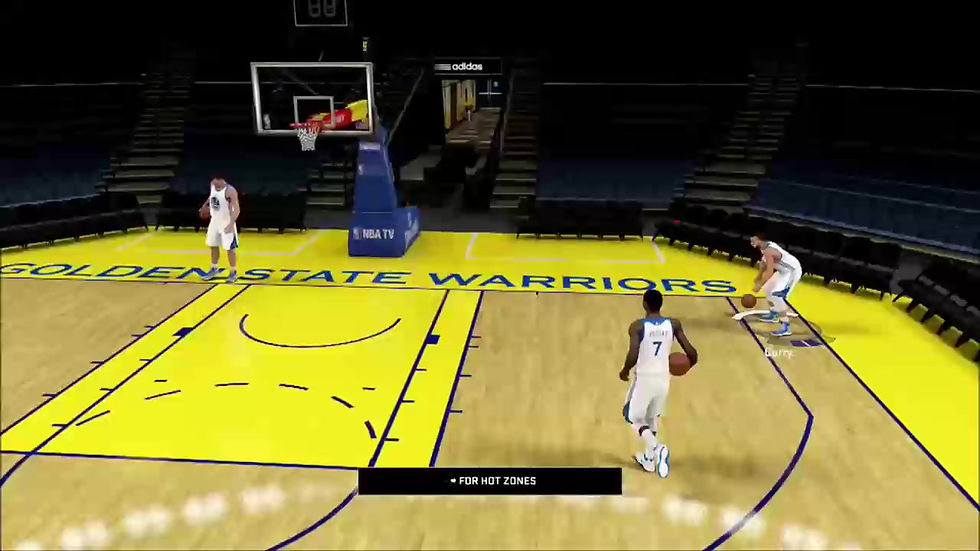
Our improvements begin right at the beginning: tip off.
In previous NBA Lives, there was no onscreen indicator or instructions of any kind.
UX studies showed that 80% of users assumed the button to press was 'X', which was incorrect. And, in NBA Live, hitting the wrong button penalizes the user by making them lose the tip-off. This meant that 80% of users began the game with a failure, one they did not know how to avoid.
By putting an instructional element onscreen, we turned a 20% success rate into an 80% success rate.
More importantly, we use this opportunity to teach that the Y button is not just the 'tip-off' button, but rather more generally the 'jump' button, which gives the user the knowledge of how to perform other jump-based mechanics in the game such as rebounding or blocking shots.
THE FIRST MOMENT

SHOT FEEDBACK
The single most important moment in basketball is the jump shot, and lots of thinking and study went into this single mechanic.
In NBA Live 15, there was no onscreen feedback for making the shot at all, while NBA 2K (NBA Live's main competitor) did have a meter. User research that I conducted clearly illustrated that our customers prefered the meter in 2K versus having no feedback at all.
COMPETITIVE ANALYSIS
The 2K shot meter was consistently identified in customer research as the gold standard. It has a lot going for it: it is contextual and easy to understand, and gives lots of juicy feedback in a tiny form factor.
But it does have some problems. It has poor affordance, meaning it doesn't intuitively communicate how the mechanic works. It also has less than perfect proximity to where the eye is looking, which we verified with eye-tracking studies of players playing the game.
Also, since it is displayed on the court floor by the player's feet, it can be easily obscured when other players or foreground elements block the player's view of the area on the floor.
The common sentiment from players we interviewed as well as on message boards, "I just watch the jump, and not the meter."
I wanted to address these problems and design a meter that was both more affordable and proximal to eye focus.
This was the first mock-up of my concept for the new shot meter. It expresses proximity to the point of eye focus (the player), and affordance of the mechanic of shooting (release at the top of the jump).
FIRST DESIGN


Unlike designing the UX for an app or menu system, the design iteration for a gameplay mechanic worked best by going directly to After Effects and making motion mocks.
MOTION MOCKS
SHOT METER UX: RESULTS
In the end, I think the proof that our shot meter was a better design than 2K's footcircle came 2 years later, when NBA 2K18 switched their ubiquitous footcircle design to a Live-inspired vertical meter.
This was 3 years ago, and they haven't changed since.
NBA 2K20
NBA 2K18
NBA 2K16
(Before)
(After)
(Present)


In the words of a customer: